
Guides
The Color Mistake That Makes Packaging Easy to Ignore
By editoruser · July 13, 2026
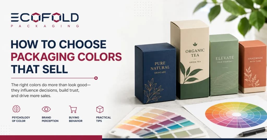
The color of packaging is processed before the product name, before the logo, and before the price. A buyer scanning a shelf makes a category signal check in less than a second. Black says premium. Brown kraft says natural. Soft pink says beauty.
Bright red says energy or appetite. The mistake is not choosing the wrong color intentionally. The mistake is choosing a color for personal taste or because it is trending, rather than because it fits the product, the shelf, and the buyer.
Why Packaging Color Works Before the Customer Reads Anything
Packaging color psychology starts at the shelf, not at the design table. When a customer looks at a shelf of skincare, they are not reading every box. They are scanning for the visual that matches the signal they are looking for: clean, natural, luxury, clinical, playful. The color stops them. The name confirms they are in the right place.
A color that sends the wrong category signal causes the customer to skip the product, even if every other detail behind the box is correct. For retail brands where shelf presence is the primary point of conversion, Custom Retail Boxes need to make that color signal work at a short distance and at a quick glance.
Start With the Product, Not Your Personal Preference
The color conversation should start with four questions before any design decisions are made.
What does the product do? A body scrub, a scented candle, a CBD oil, and a children’s snack do not share a color language. A color that reads correctly on one category reads entirely wrong on another.
Who is the buyer? A 45-year-old buying a luxury face serum and a 22-year-old buying a sleep supplement respond differently to the same shade of navy blue.
Where is it sold? A shelf in a natural food store has different color norms than a counter in a department store cosmetics section. The color that works in one retail context may look out of place in another.
What price point should the color signal? Budget, mid-tier, and premium brands communicate price through color before they communicate it through the price tag. Getting that signal wrong before the customer reads the price creates a mismatch the brand rarely recovers on that visit.
What Common Packaging Colors Usually Signal
Black: luxury, sophistication, premium positioning. Works at elevated price points; can feel inaccessible at lower ones.
White: cleanliness, clinical precision, minimal. Heavy use in skincare, pharmaceutical, and tech. Can disappear on a white shelf without adequate contrast.
Kraft brown: natural, artisan, eco-conscious. The material communicates before any ink is applied. Natural soap and personal care brands that use kraft as a brand foundation can explore Custom Soap Boxes for uncoated and kraft-format carton options that preserve that unbleached look.
Green: organic, plant-based, fresh. Effective in wellness and natural food. Risk of blending in when every competitor in the category uses green.
Red: energy, appetite, urgency. Dominant in the food and snack space. Not suitable for calm or wellness-adjacent brands.
Blue: trust, calm, reliability. Used across health supplements, dairy, CBD, and cleaning products. The specific tone matters significantly — a royal blue reads very differently from a pale slate.
Soft neutrals (cream, beige, blush): understated premium, contemporary. Growing rapidly in skincare and personal care as an alternative to clinical white.
Color Should Match the Category and the Scent
Category fit matters more than originality. A color that signals the right product type first and differentiates within it has a better chance of converting than a color that leads with novelty.
Cosmetic packaging colors in premium lines tend toward soft, sophisticated palettes: blush, cream, slate, sage. Brands looking for packaging that carries those palettes effectively can review Custom Cosmetic Boxes for the print and finish combinations that reproduce those tones correctly.
In candle packaging, the color should reflect the scent profile. Woodsy and earthy scents carry forest green, brown, and deep neutral tones. Floral scents move toward soft pinks and light greens. Citrus scents use yellow-orange palettes. A lavender candle in an orange box is sending the wrong signal entirely.
The shelf customer searching for a floral or relaxing product will walk past it. Candle brands that use color as part of their scent identity can explore Custom Candle Boxes for the print and structural options that support this kind of scent-led visual system.
Shelf Contrast Is a Design Strategy
Standing out on a shelf does not mean using a color that conflicts with the product category. It means choosing a color that holds clear contrast against adjacent products while still communicating the product type correctly.
If every competitor in a natural soap or wellness category uses kraft brown and soft green, a brand using clean deep navy with a white logo creates instant differentiation without looking like it belongs to a different product category entirely.
If the category is already dominated by dark and serious tones, a fresh soft green or warm cream reads as a distinct and accessible alternative. The goal is category-legible differentiation, not difference for its own sake.
Material Changes How Color Prints, and Most Brands Discover This Late
This is the technical detail that surprises most brands on their first production run.
A soft pastel pink on SBS white paperboard prints cleanly and accurately. The same soft pastel pink on natural unbleached kraft paper, without a white ink underprint, appears muddy and brownish. The natural brown of the kraft absorbs and shifts the ink tone. Dark and saturated colors — navy, forest green, black, burgundy — print with strong contrast on kraft without any underprint base. Light, pastel, and bright colors need a white ink layer first.
Gloss lamination amplifies color saturation and makes colors appear brighter and more vivid. Matte lamination softens and refines the same color. These are not minor differences on the shelf.
Brands choosing between paper materials and surface treatments should read our guide on kraft vs corrugated boxes for how the material choice affects both print output and brand positioning. Brands using kraft as part of an eco or natural claim can also review our guide on what makes packaging truly eco-friendly before committing to a material strategy.
Final Color Checklist Before the Artwork Goes to Print
- Does the color signal the right product category at a glance?
- Does it communicate the intended price tier before the customer reads the price?
- Has it been tested as a physical print sample on the actual material, not just on a screen?
- Is there enough contrast for safety warnings, ingredients, and required text to be legible?
- Does it create meaningful differentiation from the primary competitors on the same shelf?
- If using kraft or colored board, has the underprint requirement been confirmed?
Color coverage, specialty finishes, foil treatments, and underprint layers all affect the cost of a print run. Our guide on custom packaging cost in 2026 explains how each of these decisions changes the final quote.
Frequently Asked Questions
Does packaging color actually affect whether products sell?
Yes. Color is the first visual signal a buyer processes on a shelf. It communicates product category, price tier, and brand mood before any text is read. A color that mismatches the category or price point reduces the chance of a customer picking up the product even when everything else is correct.
What color works best for premium packaging?
Black, deep navy, and rich neutral tones are common in premium packaging, but the right choice depends on the category. In cosmetics, cream and blush tones signal luxury. In spirits, black and gold do. Premium signals come from the combination of color, finish, and material weight together.
How does packaging material affect color output?
Significantly. Light and pastel colors need a white ink underprint on kraft or brown board to register correctly. On SBS white paperboard, colors print as expected. Matte lamination softens color; gloss lamination amplifies it.
Can I use any color on kraft packaging?
Dark and saturated tones print with strong contrast on kraft without any underprint. Light, pastel, and bright colors need a white base layer to register correctly. Confirm the underprint requirement with the supplier before finalizing the artwork file.
How should I choose colors for a scented product like a candle?
Match the color palette to the scent profile and emotional mood. Floral scents suit soft pinks and light greens. Woodsy scents suit brown and forest green. Citrus scents suit yellow-orange.