
Guides
Soap Packaging Ideas: 12 Inspirations From DTC Brands
By editoruser · August 4, 2026
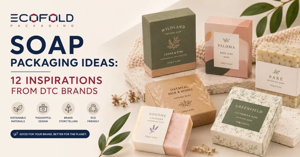
The bar of soap inside the package is invisible until someone opens it. Everything before that moment is the packaging’s job. For DTC soap brands competing in online searches, on retail shelves, and at craft fair tables, that job is substantial.
The packaging has roughly two seconds to communicate whether this is a natural, artisan, premium, or botanical brand. These twelve ideas, drawn from approaches used by direct-to-consumer soap brands, show what effective soap packaging looks like in practice.
Natural and Sustainable Soap Packaging Ideas
Kraft Paper Wrap with Seed Paper Belly Band
Wrap the bar in a single sheet of unbleached kraft paper and secure it with a belly band made from plantable seed paper. The band carries the brand name and scent name. When the customer removes it, they can press it into soil and grow wildflowers.
The eco story is built into the packaging material rather than printed as a claim. Brands evaluating natural paper-based packaging programs can explore our Custom Eco Friendly Boxes range for the full selection of recyclable and paper-based formats.
Apothecary Text Wrap Across the Entire Bar
Dense, closely set text covering the full surface of the wrap, including ingredient origins, formulation notes, brand values, and usage guidance. Printed on uncoated paper in two or three ink colors, this format reads as transparent and ingredient-honest.
The reader finds something new each time they look at it. The packaging functions as a document and a container simultaneously. This is the approach made recognizable by several natural soap lines that treat the label as editorial.
Recycled Newsprint Wrap With Brand Editorial Content
A sheet of printed newsprint or craft paper folded around the bar like a parcel, sealed with a sticker or twine. Some brands print a small column of editorial content on the paper: the story of the soap maker, the origin of the key ingredient, or a note about the batch.
The paper is content rather than just packaging. When unpackaged, the paper can be composted or recycled. For brands building eco-positioned packaging programs, our guide on What Makes Packaging Truly Eco-Friendly covers which material and finish choices support recyclability claims.
Artisan and Handmade Soap Packaging Ideas
Botanical Watercolor Illustrations on White Matte Card
A tuck-end carton in white SBS with hand-drawn or watercolor botanical illustrations printed in full CMYK. The illustration represents the soap’s key ingredient: lavender stems, dried citrus, calendula flowers, rosemary sprigs.
Matte lamination keeps the surface from looking mass-produced. This aesthetic is one of the most consistent in the natural soap category because it communicates exactly the qualities buyers in this segment look for: hand-crafted, ingredient-led, and grounded in nature.
Two-Color Screenprint on Natural Kraft Paper
A simple design, the brand name in a clean typeface and a small line illustration, printed in two ink colors on natural brown kraft wrap. The approach works particularly well for farmer’s market, craft fair, and Etsy soap brands where the artisan identity needs to be reinforced at a low cost per unit.
The craft-level aesthetic of the packaging matches what the customer expects from a handmade product and reinforces the purchase decision.
Linen-Texture Paper with Foil Stamp
A slightly textured paper with a fabric or linen weave surface, combined with a small gold or silver foil stamp on the brand name or emblem. The tactile quality of the paper signals premium positioning before the bar is handled.
This combination, textured natural paper plus one carefully placed metallic accent, is common in Scandinavian and minimalist natural soap brands that price above the mass market without using a fully rigid box format.
Premium and Luxury Soap Packaging Ideas
Matte Black Box with Spot UV Logo
A rigid or folding carton in flat matte black with the brand logo applied in spot UV coating. The surface is entirely uniform until light hits the UV area, which becomes visible as a contrast between the flat ground and the glossy mark.
No foil or metallic ink required. The effect is subtle and premium, and it has been used effectively by several men’s grooming and luxury cold-process soap brands that want strong shelf presence without decorative excess.
Slide-Out Drawer Box with Tissue Interior
A rigid matchbox-style sleeve with an inner tray that slides out to reveal the soap resting on tissue paper or a cushion. The reveal is slow and deliberate. This format works as gifting packaging for a single premium bar without requiring a full multi-bar gift set construction.
It raises the individual purchase and creates a moment at unboxing that customers photograph and share. The format is available through our Custom Soap Boxes range alongside tuck-end, window, and sleeve formats.
Window Cut Box Showing the Bar’s Natural Surface
A tuck-end or two-piece box with a die-cut window panel on the front allows the customer to see the soap’s color, texture, and botanical inclusions before purchase.
For cold-process soaps with visible swirls, herb embeds, or poured layers, the bar’s own surface becomes the front panel design. The window does the visual work that printed photography could not do as convincingly, because the customer is seeing the actual product.
Brand-Forward and Creative Soap Packaging Ideas
Color-Coded Scent System Across the Full SKU Range
A soap line where every variant uses the same box structure and layout but a different solid background color for the scent. Lavender is soft purple. Eucalyptus is deep green. Citrus is warm yellow. Charcoal is grey-black.
The system is immediately readable on a shelf and allows a customer to navigate the entire range by color before reading a word. Color-coded SKU systems are one of the most practical ways to achieve coherent shelf presence across a growing product line.
Our guide on Packaging Colors That Sell covers how color communicates brand identity and product category across different packaging surfaces.
Clear Cellophane with a Printed Paper Band
A clear or lightly frosted film wrap around the entire bar, tied or heat-sealed at the ends, with a simple printed paper band across the middle. The bar’s color and shape are fully visible.
The paper band carries all brand and compliance information in a clean, minimal format. This works especially well for translucent glycerin soaps and specialty bars where the visual quality of the soap itself is part of the product story.
Multi-Bar Gift Set in a Coordinated Tray Box
Three or five bars presented in a single lidded tray box, each bar individually wrapped in the brand’s standard paper wrap. A seasonal color palette on the tray box, coordinated with the wraps, gives the set a curated appearance without requiring separate gift packaging.
The format lets an existing soap line produce gift-ready products for holiday and occasion sales without redesigning any individual bar packaging.
What the Best Soap Packaging Has in Common
Across these twelve approaches, a few consistent design principles appear in the brands that execute soap packaging well.
The material tells part of the brand story before any print is read. A kraft wrap signals natural and artisan before the label is examined. A rigid matte black box signals premium before the price is seen. Brands that choose materials deliberately, rather than defaulting to whatever is cheapest or easiest, are communicating something to the customer from the first second of contact.
The packaging works as an object on its own. A box or wrap that looks incomplete or generic without the soap inside is relying on the product to carry the visual weight. Strong soap packaging reads as finished and intentional even before the bar goes in.
The back panel is not wasted. Whether it holds an ingredient note, a brand philosophy, a provenance detail, or a handwritten-style message from the maker, brands that put something worth reading on the back create a brand moment that outlasts the purchase experience. The customer reads the back panel at home while the soap is on the bathroom shelf.
Frequently Asked Questions
What makes a great soap packaging design?
Clarity of signal, material authenticity, and a visual identity that communicates the right brand positioning before any text is read. The best soap packaging tells you what kind of brand you are dealing with from the material and color alone.
How do DTC brands make their soap packaging stand out?
Most successful DTC soap brands commit to one strong design idea and execute it consistently across every SKU. A distinctive color system, a signature illustration style, or an unexpected structure like a slide-out box tends to work better than several design elements competing for attention.
What materials are best for eco-friendly soap packaging?
Uncoated kraft paper, seed paper, recycled board, and FSC-certified paperboard without plastic lamination. Using aqueous coating instead of gloss laminate preserves the natural look of the paper and keeps the packaging recyclable.
How can custom packaging improve soap brand recognition?
Consistent custom packaging builds visual memory. A customer who remembers the packaging design from an online purchase is more likely to recognize the brand on a shelf months later. The packaging investment creates recall that outlasts the bar itself.
What packaging styles work best for handmade soaps?
Kraft wraps, uncoated paper wraps, and minimal tuck-end cartons in natural materials reinforce the handmade positioning most effectively. Window cuts that show the soap’s hand-poured surface are also effective when the making process is part of the brand appeal.